Heuristic Analysis of Deloitte's Home Page
*When analyzing the Deloitte homepage using Jacob's 10 Heuristics, positive aspects have been highlighted with a green background, while negative aspects have been marked with red background.

1. Visibility of System Status
Designs should keep users informed about what is going on, through appropriate, timely feedback.
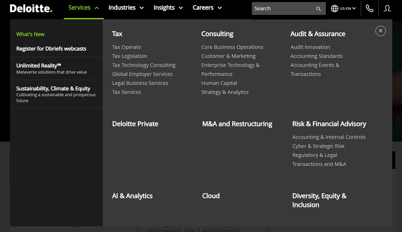
When we hover our cursor above the dropdown menus, the particular menu changes color and shows several new options beneath it.
However, on the homepage, many clickable links do not change color, making it difficult for users to recognize them as clickable text.

2. Match between the System and the Real World
The design should speak the users' language. Use words, phrases, and concepts familiar to the user, rather than internal jargon.

On the top right side, we can see options to Search followed by the iconic magnifying glass, the Phone icon representing contact options, and the My Profile section. These follow real-world conventions and make the homepage easier to use. Even the terminologies and language used are simple and easy to understand.
3. User control and freedom
Users often perform actions by mistake. They need a clearly marked "emergency exit" to leave the unwanted action without having to go through an extended process.
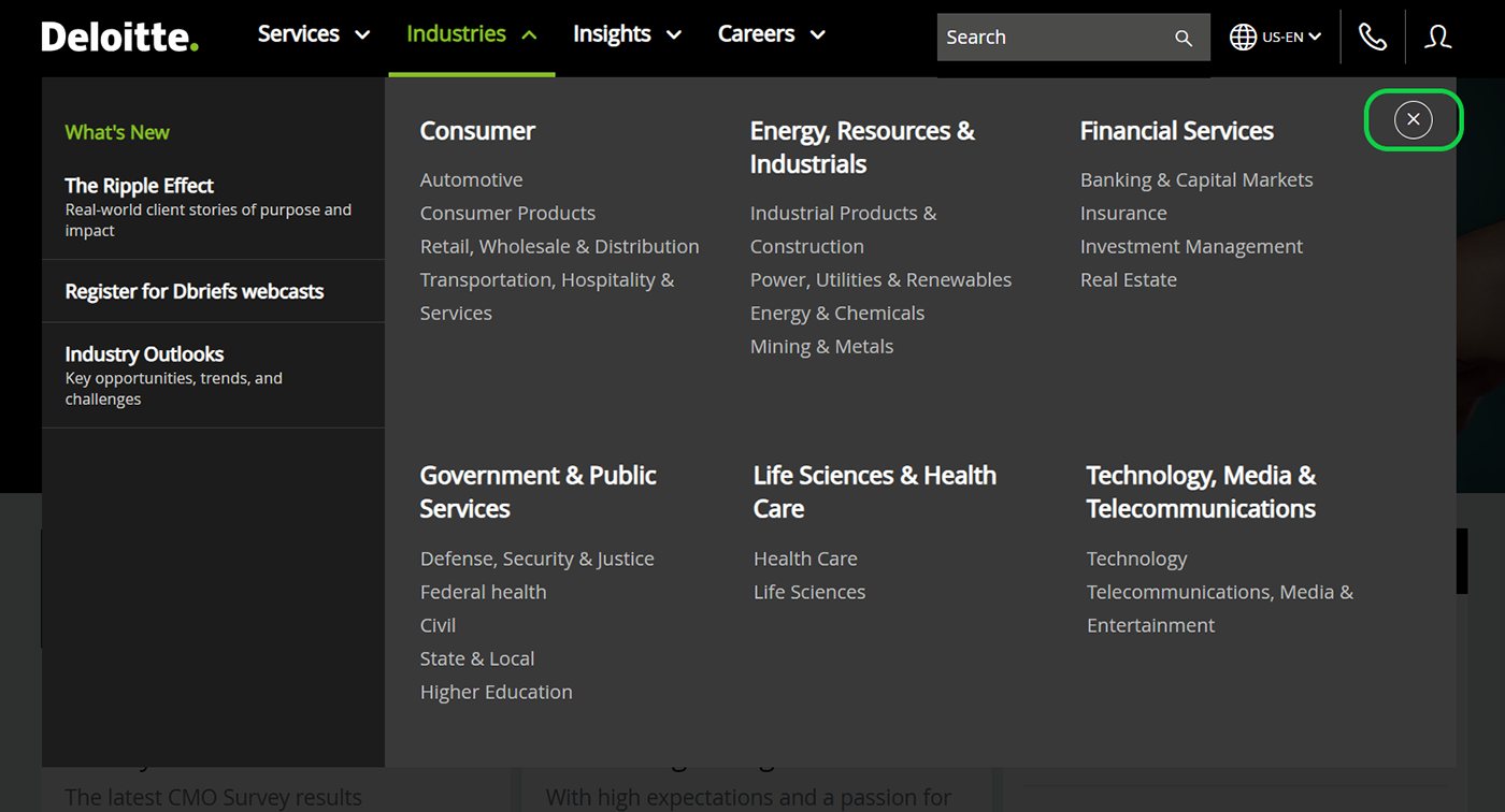
The Deloitte homepage has an Exit button on the menus. Users can easily exit any menu page at any time by clicking the Exit button in the upper right corner. The Exit button allows users to stay in control of the system and avoid getting stuck and feeling frustrated.
4. Consistency and standards
Users should not have to wonder whether different words, situations, or actions mean the same thing. Follow platform and industry conventions.

The icons used for the search bar, profile, and location are consistent with those on other web pages. Even the Deloitte brand logo is placed in the top left corner of the page, which is a common placement for logos on many websites.
Additionally, the spacing between the different cards is consistent throughout the page.
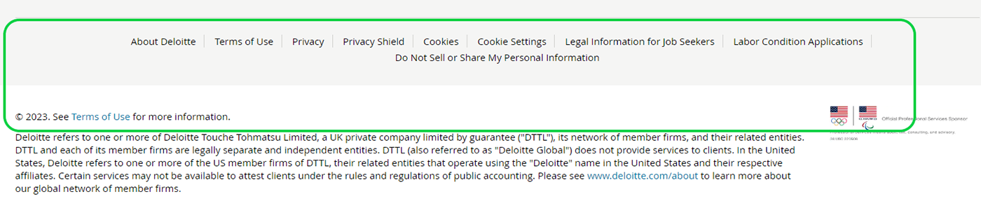
In the image below, we can see that contact options, copyright and privacy information are located at the bottom of the page, which is also common to other websites.
5. Error prevention
Good error messages are important, but the best designs carefully prevent problems from occurring in the first place. Either eliminate error-prone conditions or check for them and present users with a confirmation option before they commit to the action.

To sign up for the Deloitte site, the mandatory fields are marked with an asterisk (*), indicating that they are required. If any of these essential fields are left blank, the webpage will display a red-colored message indicating that they need to be filled out to Join.
However, if we click on the "Log out" option in the "Profile" section, we are immediately logged out without any prior notice that this action will log us out of the website.

6. Recognition rather than recall
Minimize the user's memory load by making elements, actions, and options visible. The user should not have to remember information from one part of the interface to another. Information required to use the design (e.g. field labels or menu items) should be visible or easily retrievable when needed.

When clicking on a specific option from the dropdown menus, the links we have already visited will remain highlighted in white, while the others will appear in grey.
The search bar does not display any suggestions or recent searches made by the user. This increases the cognitive load on users, who must retype and recall their previous searches.
7. Flexibility and efficiency of use
Shortcuts — hidden from novice users — may speed up the interaction for the expert user so that the design can cater to both inexperienced and experienced users. Allow users to tailor frequent actions.


The navigation bar includes dropdown menus that make it easy for users to select their desired page. In addition, clicking on the Deloitte logo within any of the links above will take us directly to the homepage.
It is worth noting that the options for Language, Careers, and Contact Us are repeated both at the top and bottom of the page. This can be helpful for new users who may have browsed through the entire page.
However, clicking the Deloitte logo on the Sign in Page doesn't seem to direct us towards the homepage.

8. Aesthetic and minimalist design
Interfaces should not contain information that is irrelevant or rarely needed. Every extra unit of information in an interface competes with the relevant units of information and diminishes their relative visibility.
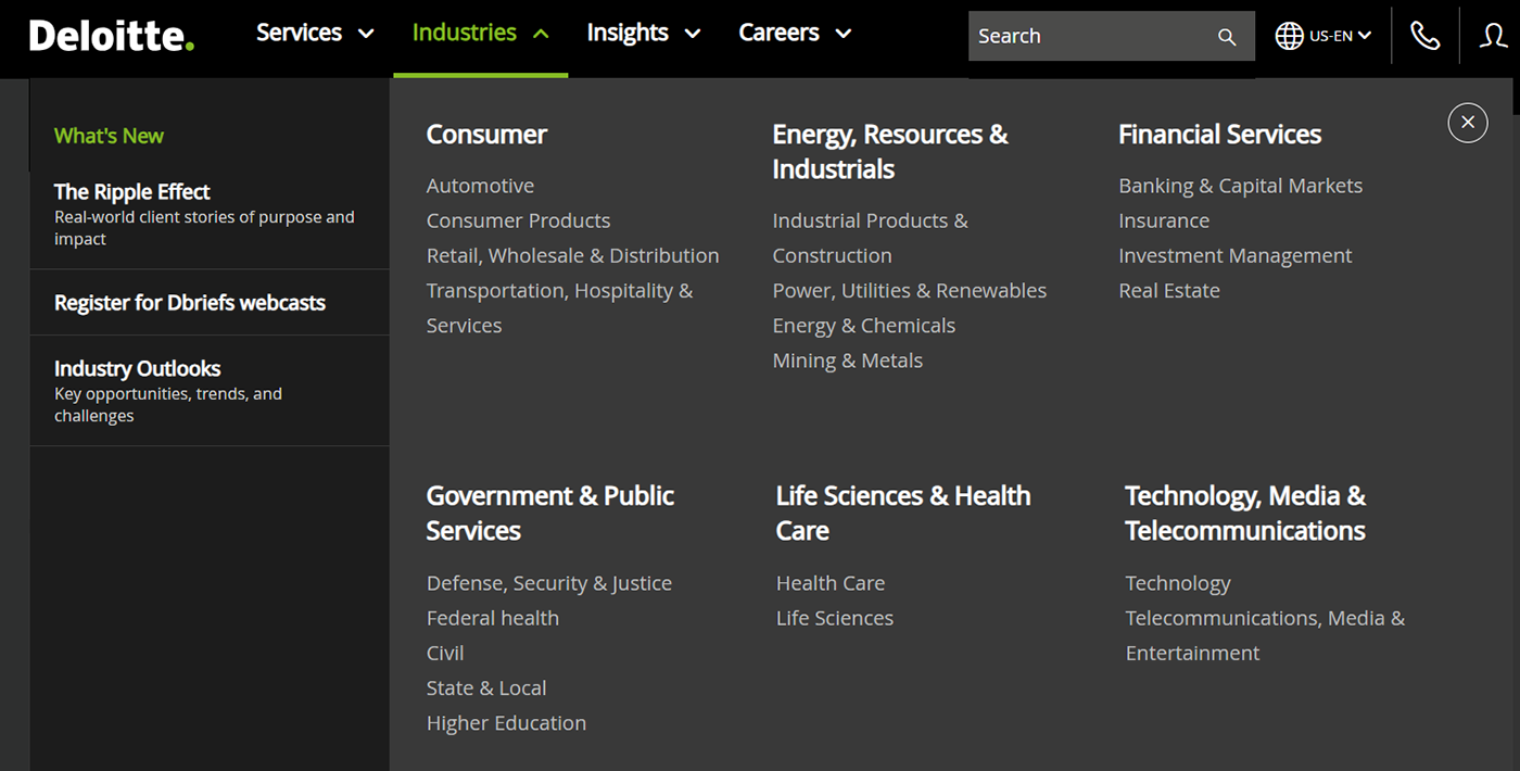
The dropdown menu section is aesthetic to look at and the different subheadings are clearly distinguishable and make it easy for the user to choose their desired page.
Too many articles crammed together in the same area makes the homepage look visibly congested, which may overwhelm the user and lead to them overlooking important information.

9. Help users recognize, diagnose, and recover from errors
Error messages should be expressed in plain language (no error codes), precisely indicate the problem, and constructively suggest a solution.
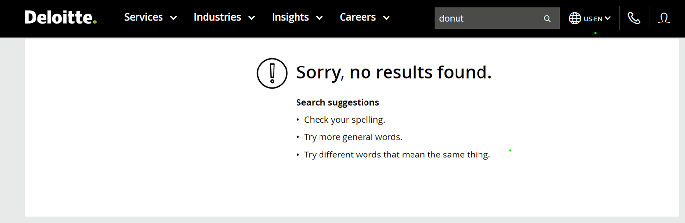
The website clearly explains what we cannot search for when we use a word that is not in their database and advises us to use more generic terms and check for spelling errors.
10. Help and documentation
It’s best if the system doesn’t need any additional explanation. However, it may be necessary to provide documentation to help users understand how to complete their tasks.

It is simpler for new users to get in touch with Deloitte customer care if necessary thanks to contact options at the top and bottom of the homepage.
However, there is no FAQ area on the website, which would allow visitors to look up frequent questions without becoming lost in the options and saving them time.

